Work

Work Example

SPARK @ Stanford

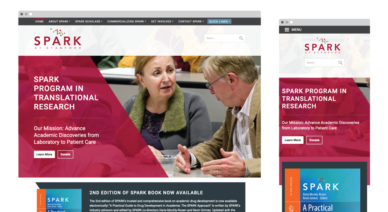
The mission to advance academic aiscoveries from laboratory to patient care.

Portfolio Image
⇅ Scroll for more

Project Overview

SPARK at Stanford stands as the epicenter of the program's visionary Regional Directors, individuals at the forefront of medical advancements. We were tasked with the mission of developing a website that powerfully conveys the program's transformative impact on the medical landscape. To fulfill this objective, we embarked on creating a visually stunning website that seamlessly merges engaging content, fostering an unparalleled user experience.

Visit Website

My Role:

  • Strategy
  • Design
  • Programming
  • Maintenance
  • User Experience

Results

With its launch, SPARK at Stanford has rapidly ascended to the forefront of medical innovation, establishing itself as an industry leader through its impactful 'Bridging the Gap' blog, the introduction of groundbreaking grant opportunities, and its unwavering commitment to funding pioneering treatment research concepts for COVID-19.
Website Example
Getting the Word Out
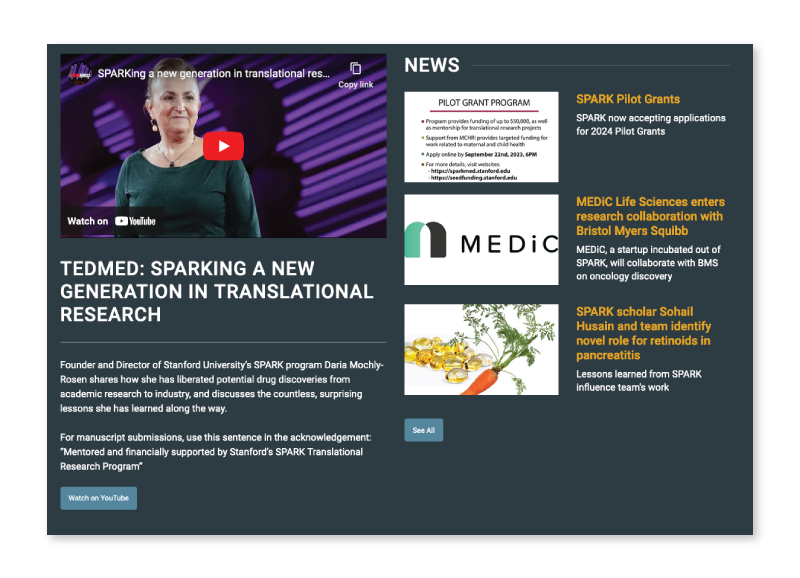
A key objective of this project was to elevate the program's visibility and amplify its mission. By dedicating a prominent section on the homepage to highlight viral content, we have effectively avoided burying the lead and successfully drawn attention to other timely and relevant content.
Website Example
Finding the Spark
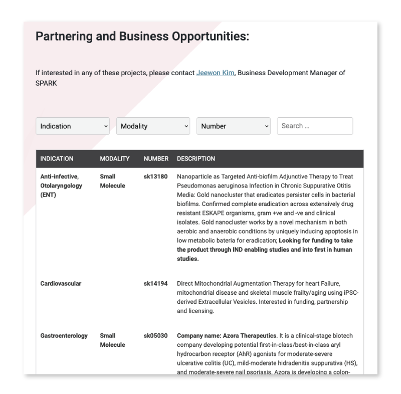
The academic rigor of the subject matter demands a more refined approach to meet the audience's expectations. In response, we developed tools that visually convey trust while maintaining practicality and effectiveness. Informed by in-depth research into the tools commonly utilized by researchers and academics, we sought to create familiar patterns while introducing enhancements to streamline their user experience.