The Department of Chemical and Systems Biology explores the molecular mechanisms that underlie cellular function and contribute to human disease. Our laboratories emphasize interdisciplinary research that spans the biomedical sciences, including signal transduction, cell cycle regulation, chromatin remodeling, protein homeostasis, metabolism, and cell differentiation. While working on this Westminster project, I was the New Media Art Director.
My Role:
We began by visiting the campus, interviewing stakeholders, and benchmarking against similar websites. It became clear: the department's new website would prioritize serving its own community. To understand their diverse needs, we conducted a comprehensive audit of their online presence, mapping everything from the main website to individual labs and programs. This holistic view exposed two key areas for improvement: technology infrastructure and staff training for ongoing website updates. Addressing these became our top priorities.
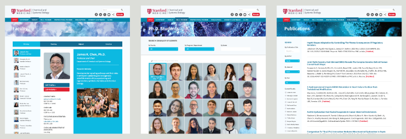 Content that serves and engages the audience
For this website, building a thriving community takes center stage. Every decision revolves around serving users' needs, from engaging content to a seamless user experience. Imagine a dynamic student directory, mirroring their journey through the department. Picture a unified faculty and lab presence, simplifying information access for all audiences.
Regular social gatherings and well-promoted events like lectures and guest speakers would foster interaction. While community reigns supreme, we won't neglect modern flourishes. A stellar mobile experience, user-friendly tools like WordPress CMS, and robust SEO ensure discoverability and ease of use.
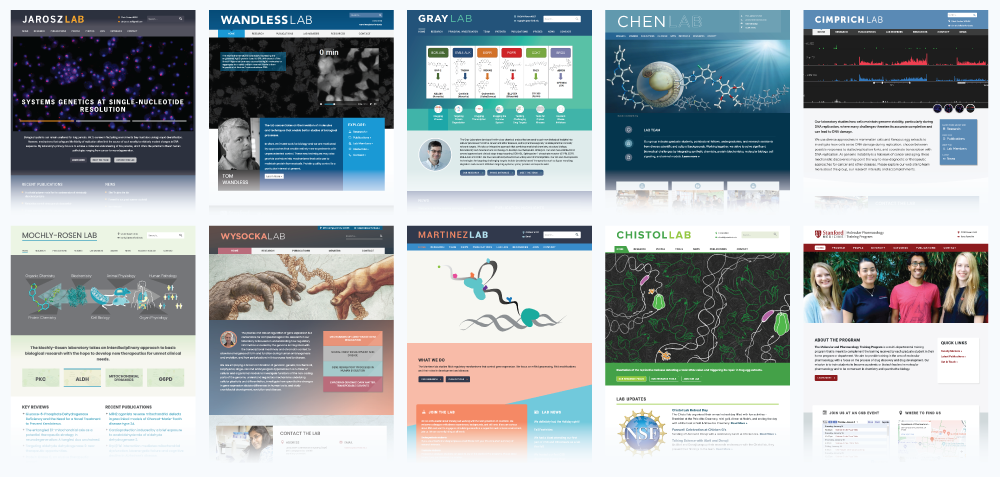 Many lab websites were also individually produced to have harmony with each other and the Department website.
Great user experiences, I argued, come from prioritizing function, then enhancing it with beautiful form. I proposed content channels catering to what the audience valued most. Instead of flashy aesthetics, we built content channels based on audience needs. Faculty pages, publications, and student directories became relevant, sustainable, and everyday useful.
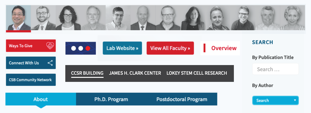 User Interface elements that are consistent, effective, and engaging. Graphics updated January 2024.
But function wasn't enough. We layered on delightful design touches – interactive buttons, purposeful color palettes, and profile photos – to make the content enticing and explorable. Each element aimed to foster trust and reliance, becoming a daily resource the community could count on.
This website wasn't just built, it was nurtured. After meticulously undergoing official review by Stanford's Brand Compliance and IT departments, it finally launched, ready to serve its community.
 Website technology partners/platforms that achieve objectives.
But the story doesn't end there. The success of the strategy speaks for itself: key indicators like visit duration and pages per visit steadily climbed, reflecting the website's growing engagement and usefulness.
And the dedication doesn't stop there. Administrators continue to maintain the website with impeccable dedication, ensuring it remains a reliable and up-to-date resource. This commitment has even blossomed into several ancillary website projects, further expanding the reach and impact of the original initiative.
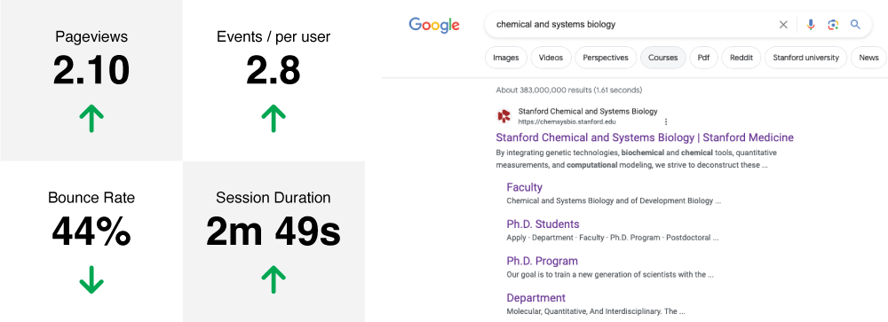 Improvement trends for some key statistics in 2023 and unbranded, anonymous SERP for 'chemical and systems biology'.
This journey from cautious launch to thriving community hub is a testament to the power of thoughtful planning, meticulous execution, and ongoing dedication. It's a story that continues to unfold, promising an even brighter future for the community connected by prioritizing User Experience.