Westminster is a creative promotions agency offering strategic execution on all your marketing initiatives since 1996. Centrally located within Silicon Valley, Westminster offers execution on everything needed to tell your brand story; brand identity, branded merchandise, printed materials, event marketing, web design, e-commerce, and fulfillment. Through personalized service, strategic guidance, and quick turns with efficiency, Westminster is not just your vendor but also a partner. While working on this project, I was on staff as the New Media Art Director.
My Role:
Westminster's existing website wasn't reflecting their true quality or aligning with their evolving brand identity. They sought a digital reinvention – a user-friendly platform that showcased their expertise, streamlined navigation, and fostered exploration. Here's how I helped bring this new vision to life:
Westminster's 2018 brand refresh demanded a matching digital counterpart. Our design embraced a dual purpose: retaining familiar elements for existing clients while welcoming new ones through a modern aesthetic. This wasn't just a facelift; it was a bridge between generations of Westminster.
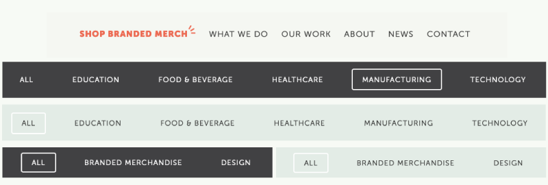
 New interface design elements
User empowerment was paramount. The prioritization was browsing over search, crafting a clear content hierarchy and intuitive navigation that seamlessly connects visitors to every tool and resource Westminster offers. The backend and frontend alike were built with this in mind, ensuring a frictionless experience for everyone.
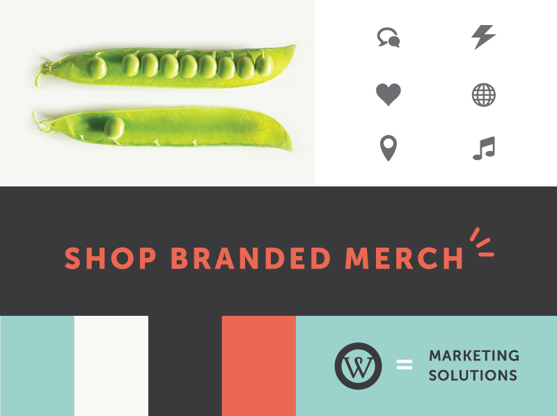
 New Design Assets
But I did not forget existing clients. Restructuring the site included new tools designed specifically for them, like the branded merchandise search and file upload feature. This enhanced their experience while showcasing our commitment to ongoing client satisfaction.
My goal was to prioritize both user experience and unveil a contemporary aesthetic. Subtle nods to Westminster's history weave through the site, while modern features like homepage animations, category sliders, and responsive hover states keep the experience fresh and engaging. The navigation was revamped, opting for a minimalist layout and clearer structure that makes finding what you need effortless.
 Upgraded website technology partners/platforms
When it was time to code, I didn't just give the site a new coat of paint, it was rebuilt from the ground up on WordPress. This migration from ExpressionEngine ensures future scalability and updates. Streamlined content migration and restructuring the sitemap laid the groundwork for a seamless flow. But we didn't forget the content creators! Revamping the backend and templates created a versatile system that empowers site editors to easily customize and add new content with WordPress's intuitive WYSIWYG editor. The result? A robust system that's a breeze to manage, leaving editors free to focus on crafting compelling content.
“Jack created our web department from the ground up at Westminster and has developed it into a professional web agency, serving organizations such as Stanford, CZ Biohub, Meta, and more. A highly skilled designer and programmer, Jack’s greatest strength lies in his strategic approach to projects...”
- Amanda Ray | Director, Marketing
The new Westminster website isn't just visually stunning; it's strategically crafted to deliver impact. Content is presented with laser focus, showcasing Westminster's quality and expertise in a way that resonates with both new and existing clients. This clarity attracts new businesses while strengthening relationships with established partners.
 Content marketing for the users includes product search, portfolio, and a frequently updated content section
But it doesn't stop there. The website now empowers content creators with flexible editing tools, allowing them to keep the site fresh and dynamic. This means a constant stream of engaging content for the thriving community of members, fostering deeper engagement and a continuous flow of new information and valuable resources.
 Comparison of some key data points from 2017 vs 2022
Boosting user volume was a top priority to gauge the effectiveness of SEO, SERP, and content marketing initiatives. The strategy proved successful, attracting more visitors. However, we observed that the new traffic contained a higher proportion of peripheral users, which impacted bounce rates and session duration. Despite this, the core conversion goals remained consistent, indicating that our efforts to attract qualified leads were yielding positive results.
In short, the new messaging and structure of the website isn't just about aesthetics; it's about driving results, building relationships, and creating a community that thrives on Westminster's expertise.