Developing next-generation software products specifically designed for an evolving broadcast industry.

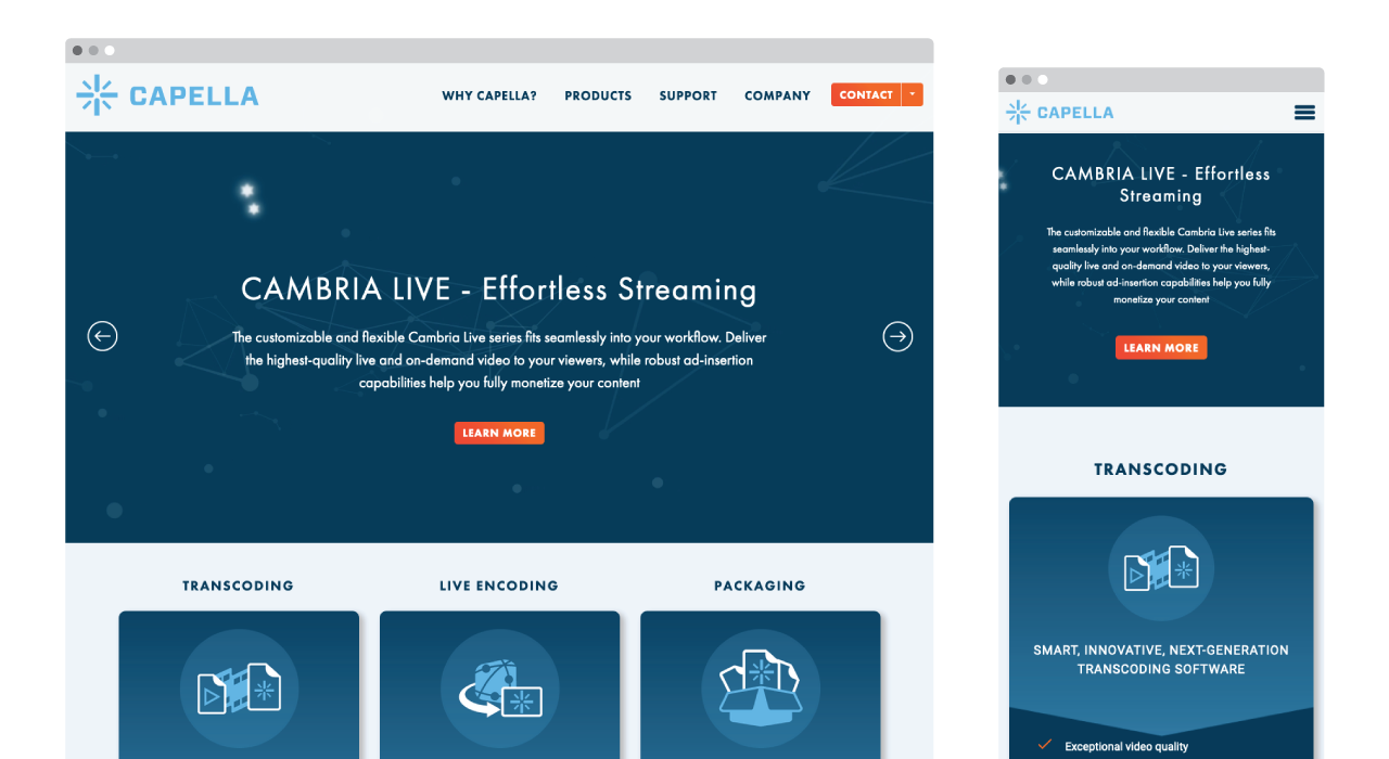
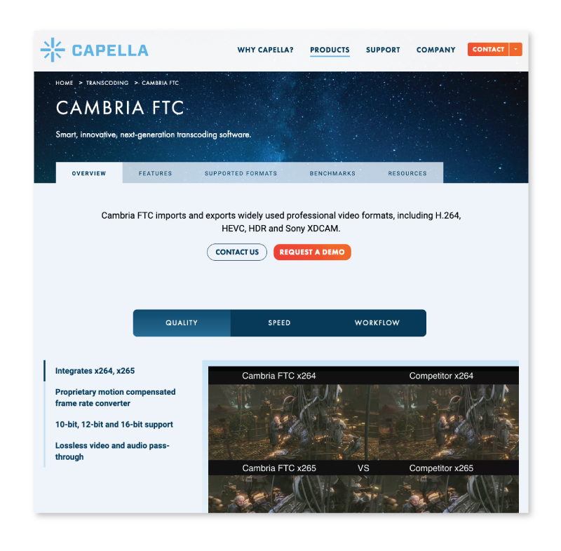
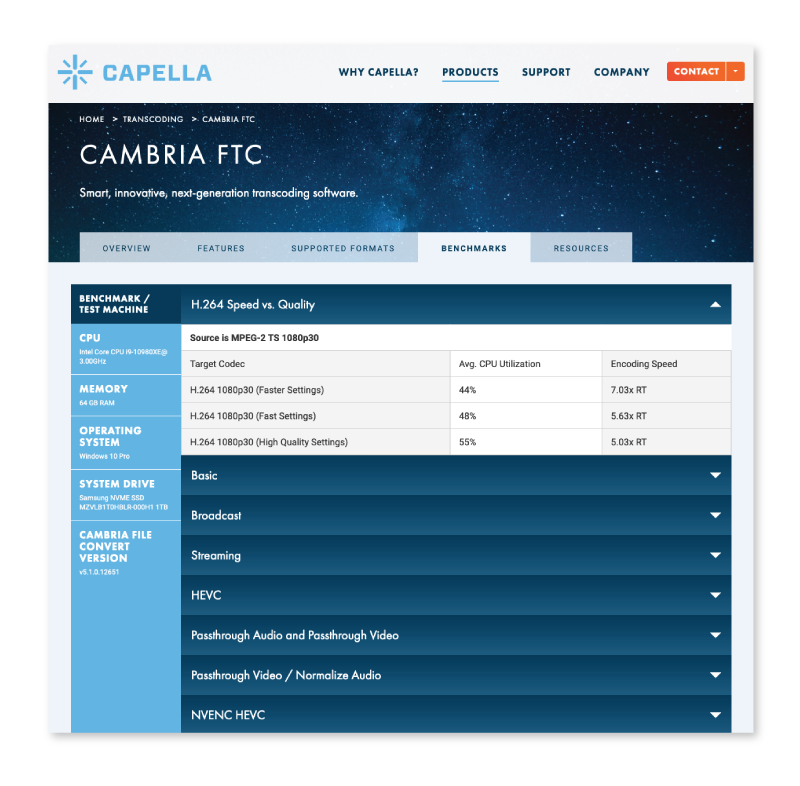
Navigating the challenges of the pandemic, Capella Systems partnered with us to modernize their website, ensuring that their groundbreaking broadcast technology products took center stage. To effectively convey the intricacies of their products, we meticulously crafted product pages that provide in-depth explanations of their functionalities and precise technical specifications. Additionally, we embraced the cosmic theme that forms the cornerstone of their brand identity, drawing inspiration from the Capella star, one of the night sky's most brilliant celestial bodies. This strategic integration of cosmic imagery elevated the website's visual appeal, instilling a sense of admiration and trust among potential customers.
Visit WebsiteCapella Systems has established their website as a cornerstone of their communication strategy, employing it to share press releases announcing their groundbreaking product updates and bolstering their presence at industry trade shows. As their products embark on a journey of continuous improvement and innovation, the website must remain adaptable, ensuring that product pages can effectively document these advancements while providing a user-friendly and administrator-friendly experience.

